Onboarding for GeekHunter

Recruiting Marketplace for Developers
Project Overview
Many people registered on the platform, but the vast majority of them were not hired because they did not meet the minimum score of 120 points.

To better understand the problem, I mapped the user journey and interviewed platform users. I discovered that users were unsure of where they were in the process and what they needed to do to move forward.
My Contributions
My role was to structure the new flow with the developers and to collaborate with the marketing team on the content of the screens.
To better understand the issue, I examined the conversion funnels of the candidates on the platform. It was clear that the final two stages had the greatest influence on the process. Being the penultimate stage, with a 30% conversion from the previous stage (starting the test) and the remaining 15% conversion from the previous stage (passing the test and having the profile approved on the platform).

And this was a significant issue for the acquisition. Despite the fact that 100 candidates with complete profiles entered the top of the funnel, only 4 were approved.
Empathize
Data Analysis
Interview
Problem
Candidates perceived unconsciously that the benefit of taking the tests was not worth the effort required.
The solution was to incentivate the users to take the test making the process user friendly and faster. Together with the developers, I mapped the entire flow and separated it into stages so that the user knew where he was in the process and what he needed to do next. As a result, the backend began to take shape, while I worked on the layout in parallel.

I mapped the entire flow and divided it into phases with the developers so that the user knew where he was in the process and what to do next. We then started structuring the backend while I designed the display layout.
Solution
Journey Mapping
Workshops
The goal of the layout was to inform and direct the user to take action. In collaboration with the marketing team, we wrote all of the explanatory texts for each stage of the process.

To improve readability, I used information hierarchy principles, as well as color patterns and brand identity elements.
Ideate
Wireframing
Prototype
We then put everything together and created triggers to send emails as the user progressed through the process.

To test the entire flow, we chose one-third of the users who already had an account but were stuck in the onboarding process. Then we redesigned the entire flow for new users.

We gathered feedback and made some changes after the new onboarding was released.

The results were fantastic!We tripled the number of appoved users in the database. Not only were more candidates admitted, but qualified ones as well.
Testing and Results
Mail
Triggers
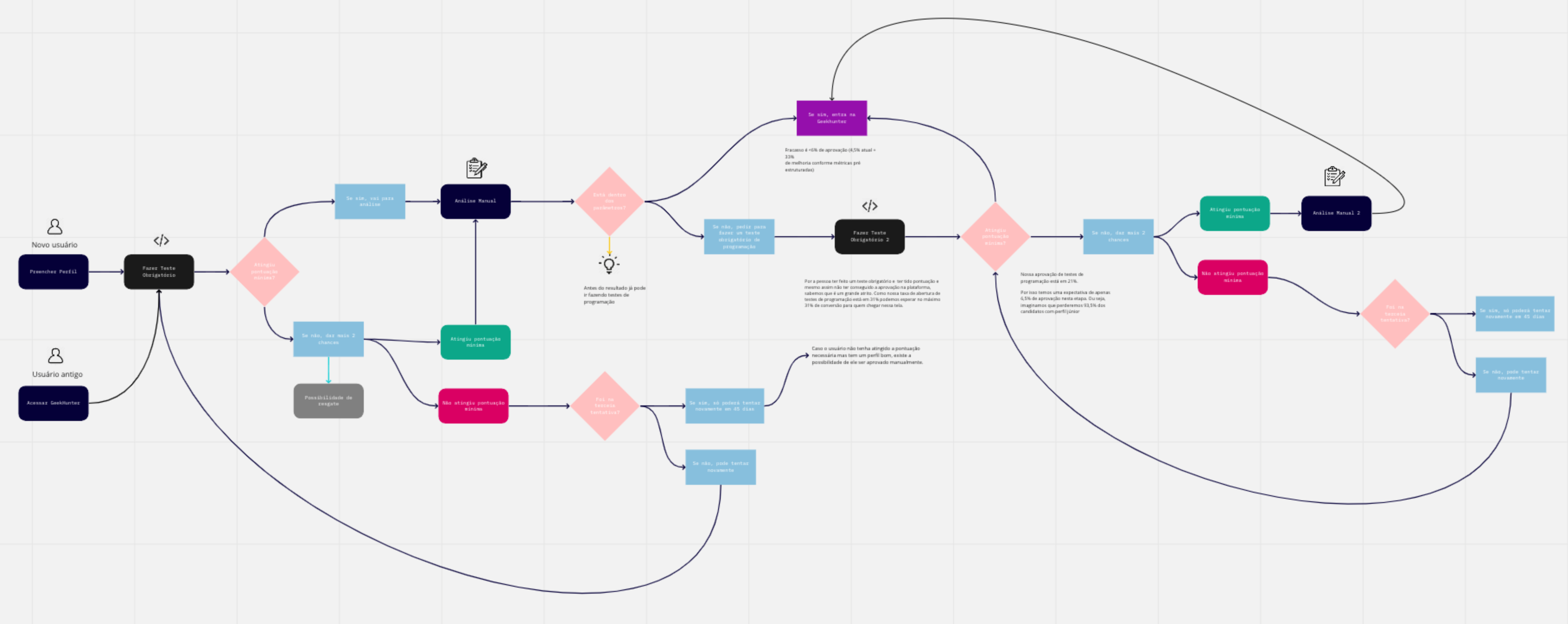
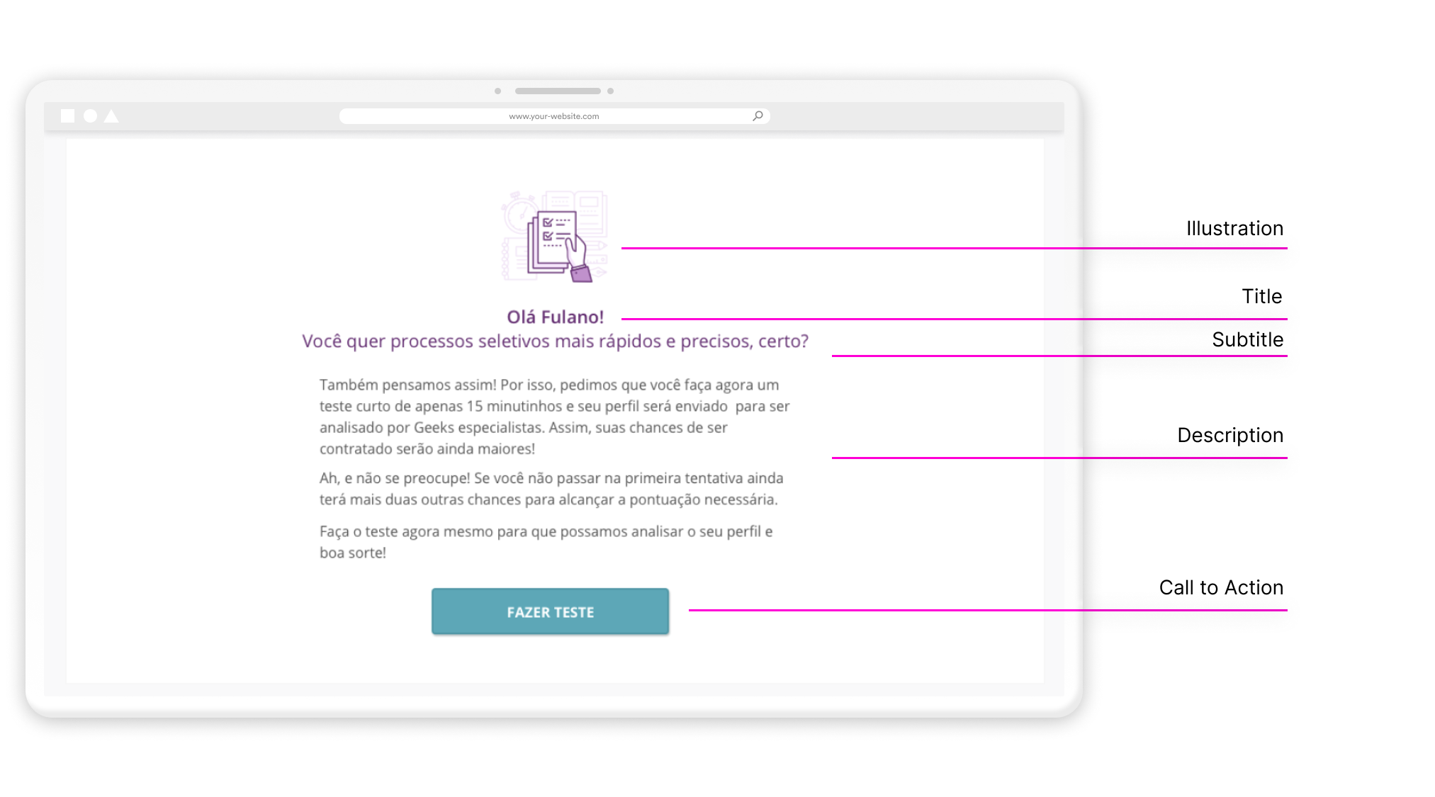
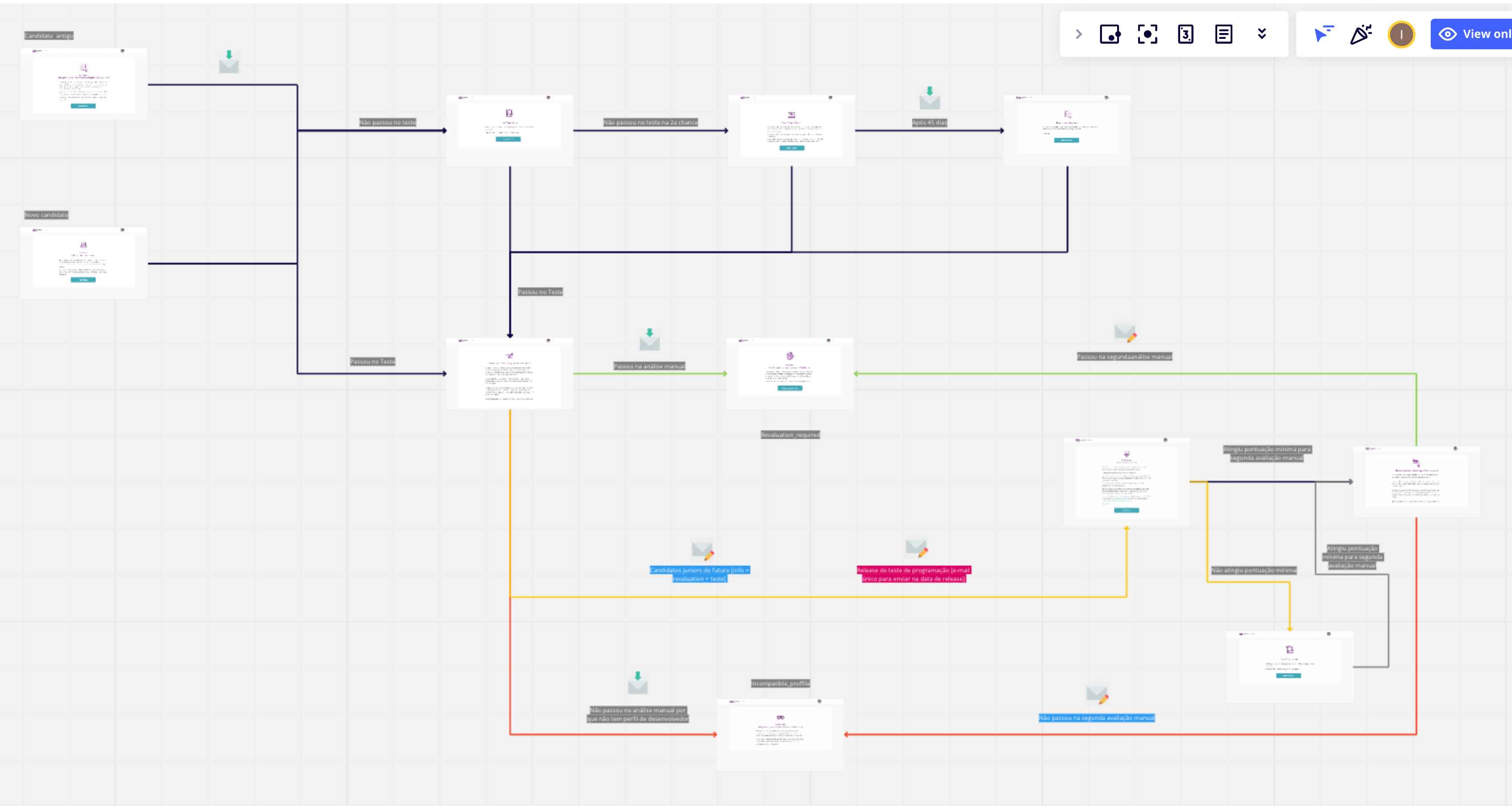
Throughout the process, I learned that UI design does not have to be complex. The layouts were all extremely simple but well written. This project taught me the value of user experience and the importance of working with a diverse team of developers, product managers, CTOs, data scientists, and marketers.

Knowing how the user felt and understanding their problem from their point of view gave me more confidence to make business decisions that affected the entire company.

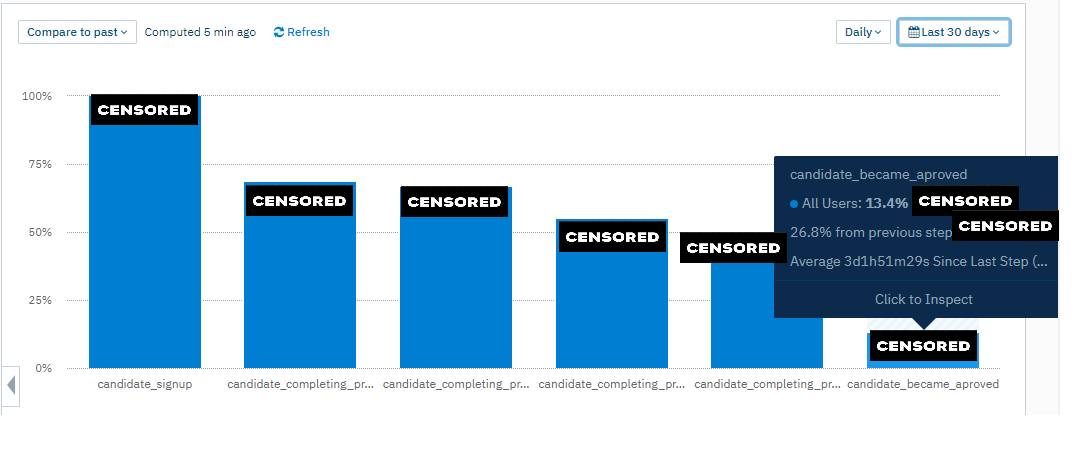
The outcome of this case also influenced how people perceived the brand after becoming users and going through the onboarding process. Because this was the user's first interaction with the platform, they had a favorable impression of the brand and were eager to be hired.
Learnings

Let's work together

Get in touch
Linkedin
contact@isauxdesign.com

Let's work together

Get in touch
Linkedin
contact@isauxdesign.com